Building for Android TV — Episode 1
Learning nuts and bolts.. The hard way.
This is the first of a series of technical articles that will deal with building apps for Android TV. The official documentation is still at an early stage and it doesn’t give hints on how to create a more custom experience. This articles will, hopefully, give you the missing bits.
Introduction
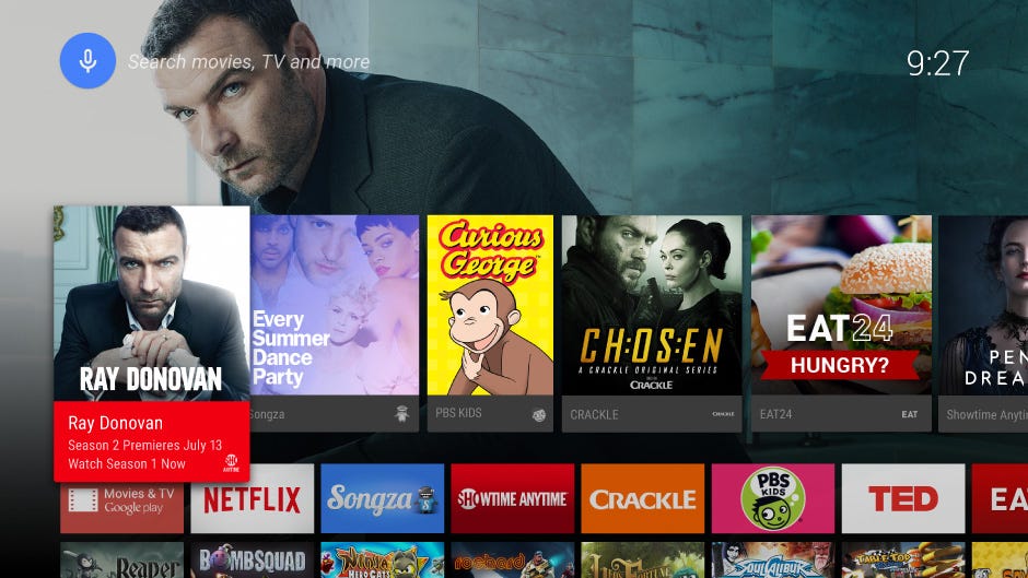
Android TV is the newly announced platform that will be taking over your living room. It runs Android 5.0 and you can use apps. And games. So cool.
The official documentation can be found here. Now that Android Lollilophas been announced, things should be pretty stable. There are two main sections that you should read:
- Design for TV — gives an overview over the design components of the TV experience and the style you should be leaning to
- User Interfaces for TV — introduces the developer to topics like navigation, layout and components for TV apps.
Finally, you need a way of testing the app. If you were lucky enough to snatch an ADT-1 preview unit, go ahead. Otherwise, the good ol’ emulatorwill get the job done. Or, you can wait for the newly announced Nexus Player, ‘cause that’s what I will do!
Demo project
The best starting point is the TV demo project that comes with the L Developer Preview SDK. You can create a new TV project by selecting the “TV” option:
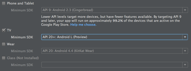
The demo project is already filled with examples that show the main structure of a TV app. We will use it as a reference for this series of articles.
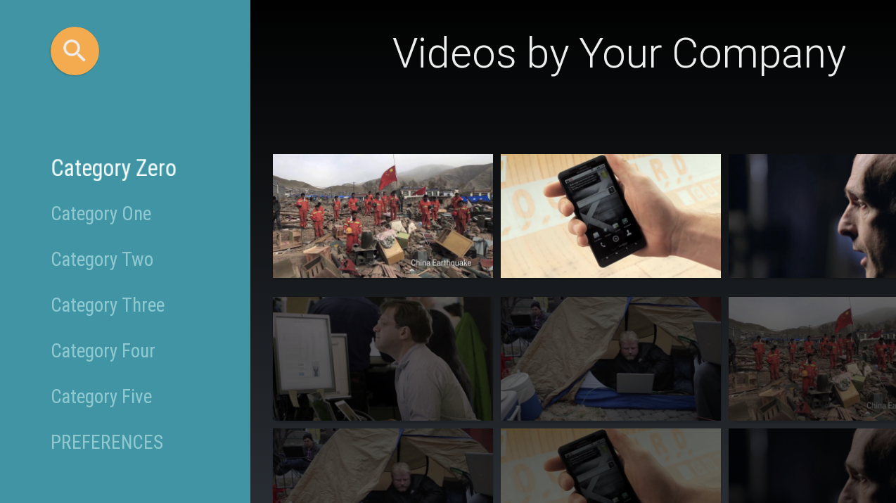
Once you run the demo, you will get this:
Building blocks
Google wants you to build awesome TV experiences with your app, and it’s offering to do the heavy lifting for you. Meet the Leanback support library, a library that provides you with pre-built components for your TV interface, such as BrowseFragment, DetailsFragment, SearchFragment andVerticalGridFragment.
BrowseFragment
The main component that is used to present the content items is calledBrowseFragment. The documentation states that BrowseFragment allows the developer “to create a primary layout for browsing categories and rows of media items [with a minimum of code]”. And it’s definitely true. Some of the possibilities offered by this fragment are:
- display either a title (e.g. “Videos by Your Company”) or a ‘badge’ in the top right corner
- customize the brand color and the search color
- add listeners to different events
- search for content via the dedicated ‘Search orb’ button
It’s structure is pretty straightforward, since each row on the right has a corresponding title on the left.
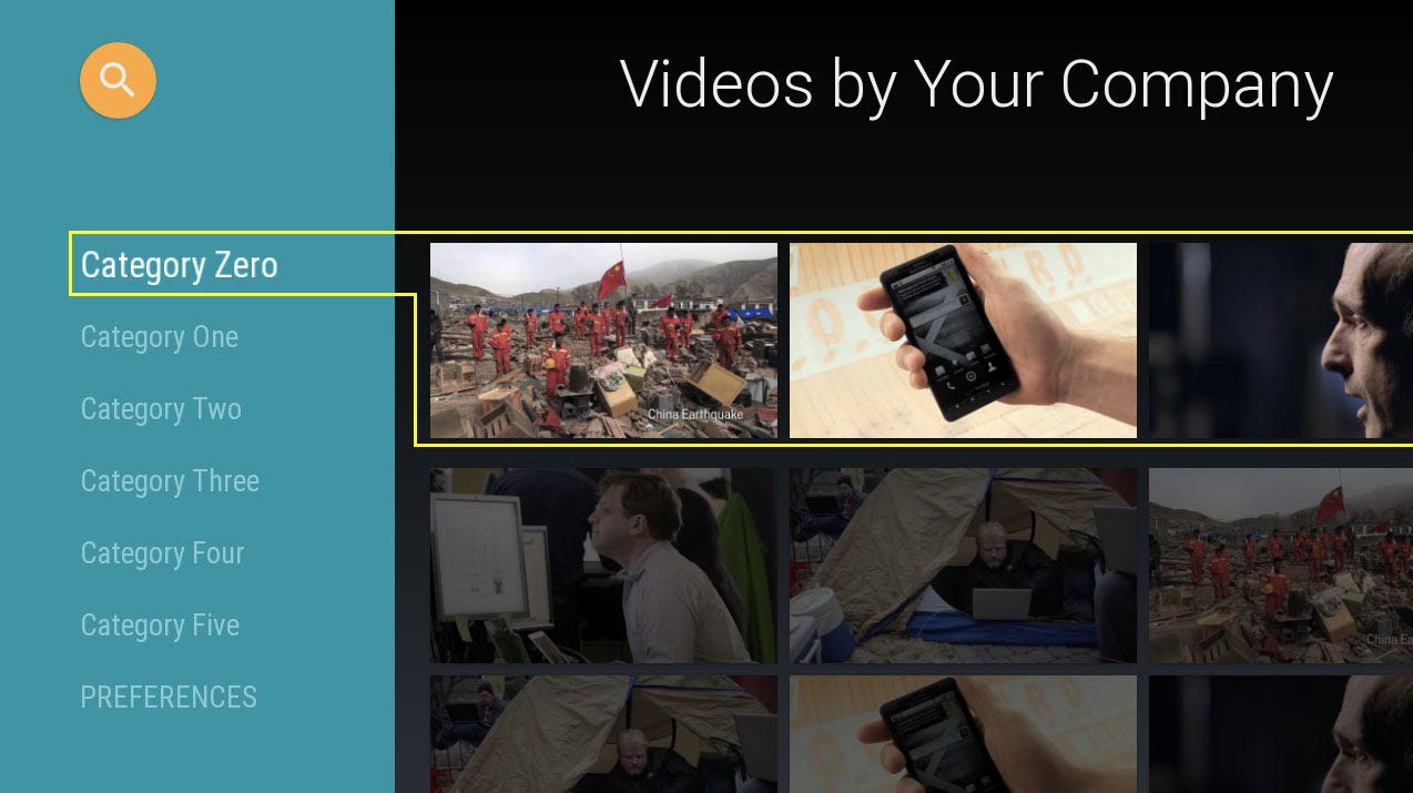
BrowseFragment offers a great experience out-of-the-box: it presents the content in a TV-oriented mind, it does all sorts of fancy animations, it eases the navigation between rows. But it comes with a great limitation: what if you would like to have, say, two rows per each category on the left? This fragment does not allow you to do that. There is a way, though, and we’ll learn how to do it in the next article ;)
SearchFragment
By pressing the top left ‘search orb’ button you have the chance of using theSearchFragment component. There’s nothing much to say here: you get notified every time the query text changes, so that you can perform the search and present the results in one or multiple rows.
The TV demo doesn’t provide a working example for the search part, so I’ve added a simple TVSearchActivity and a TVSearchFragment to showcase this functionality. The link to the code can be found at the end of this article.
DetailsFragment
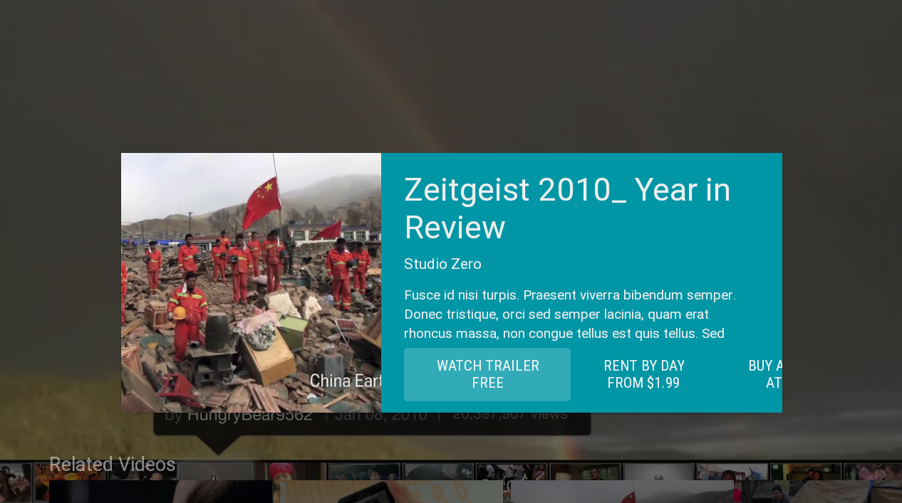
If you want to display some information about the content that the user has selected, you can use DetailsFragment. It’s beautiful, it matches your brand color and you can even provide an additional row of related contents.
VerticalGridFragment
This fragment is extremely useful when you have tons of items to display. As the name suggests, items are arranged in a (configurable) number of columns. Again, this fragment is not showcased in the TV demo project, so I added a simple example that demonstrates how to use it.
Conclusions
Google has done an insanely good job to ease the developer’s task of creating a TV application, mainly thanks to the Leanback support library. It literally takes 2 hours to create a fully working and possibly fancy app, which is awesome.
However, it seems that Google wants to “standardize” the UI of TV apps as much as possible, both to provide a common usage pattern and to preventdevelopers from making mistakes.
As usual, it’s possible to go custom, but it takes quite some time and quite a lot of efforts, as we will see in the next article in this series.
I hope you enjoyed the reading and, most of all, that this article has been somewhat useful for you. ☺
Code
All the code for this first article is available on GitHub here: Episode 1.


No comments: